Pam Moore – Relevant Work Samples
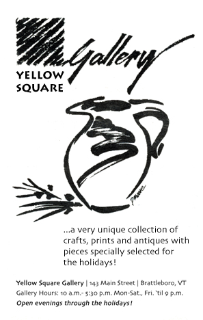
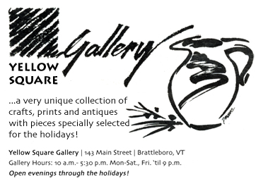
Banner ads produced for Casey Family Programs web publications.




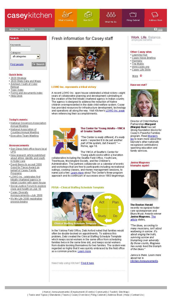
Left: Intranet Home Page produced fresh, weekly, for Casey Family Programs website. Note the appearance of the old PDSA logo (center column, yellow-green circle) which I subsequently updated, on the fly. The updated version appears in the PDSA banner ad, above, bottom right.
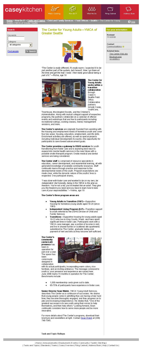
Right: Casey Family Programs intranet interior page. Note the Center for Young Adults logo which I did not originally create, but re-created on the fly, to meet our stringent technical standards, within strict publication deadline.
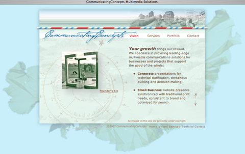
Left: Website design for Communicating Concepts, located on Vashon Island, capturing a maritime look and feel.
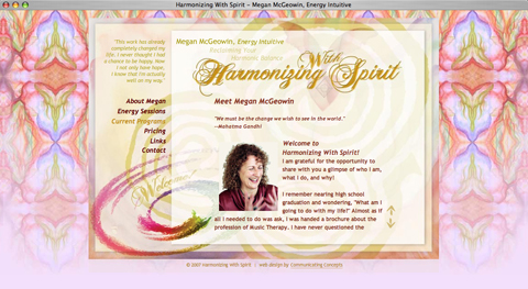
Right: Website design for Harmonizing With Spirit, capturing the look and feel of an interleaving of spatial dimensions.
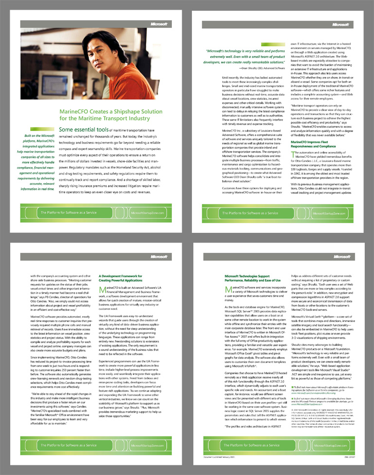
InDesign page layout for Microsoft Corporation publication.
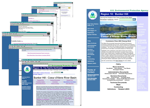
Website information architecture redesign for URS client, Region 10 EPA. On the left are all the screen shots it took to capture the full length of the former home page. On the right is the revised home page, all links rerouted to revised and consolidated sections.
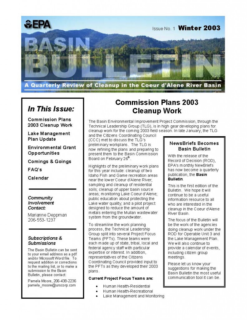
Left: Quarterly journal produced for URS client, Region 10 EPA, including masthead design. Worked within constraints of existing EPA Microsoft Word criteria.
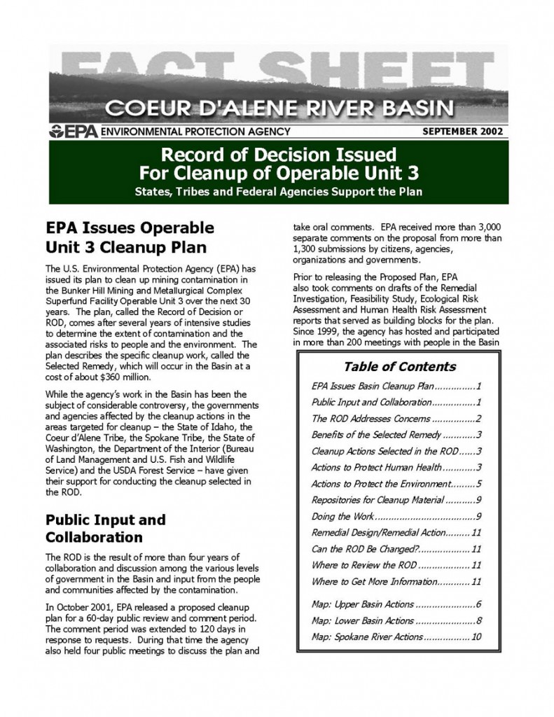
Right: Twelve-page distillation of a multi-volumed Record of Decision, targeted toward a layperson audience. Worked within constraints of existing EPA Microsoft Word criteria.
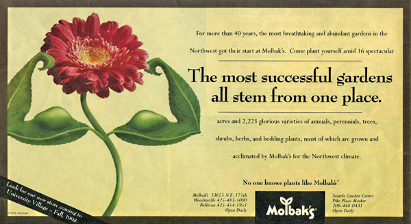
Layout for Molbak’s magazine display ad.
Layout for Molbak’s seasonal brochure.

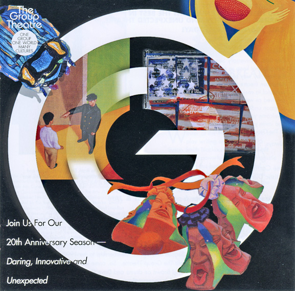
Layout for Group One Theater collateral materials.

Early newspaper ad design for Yellow Square Gallery. I created the spot art (hand-crafted pitcher) to integrate with the look and feel of the client’s provided logotype mark, as well as comped up the ad in various formats.
